
Craigslist App Redesign
Redesign the non-user-friendly interface of the Craigslist App, which is a platform operating classified advertisements with sections devoted to jobs, housing, items, services, etc.

Timeline
2023 / 1 month
Role
UX Research, UI Design
Tools
Figma, Adobe Suit

About Craigslist
Craigslist is an American website that hosts classified advertisements, which cover a wide range of topics, such as housing jobs, items for sale, services, and community events.
It was founded in 1995 (28 years as of 2023) and has since grown to become one of the most popular websites of its kind in the world.
Project Goals
01
Re-design the Craigslist App to have an up-to-date and modern design.
User Research
Interview & Review
Analysis of user research
O2
Outdated layout and structure
To update the app’s visual design and overall UI
01
Lo-fi Wireframe
The problem statement
Craigslist has been serving as one of the biggest marketplaces for all sorts of listings globally. However, the website's layout has remained stagnant for an extended period.
Re-design the Craigslist App to enhance the user experience for Its users.
02
Improve the usability by organizing and presenting the categories better.
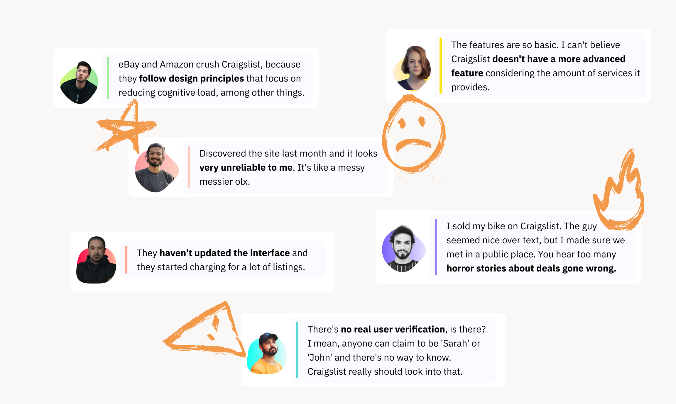
I wanted to understand the pain points of previous and existing users so we could create a better experience for potential users. Due to time constraints and limited resources, we did 2 in-person interviews and utilized Reddit for our user survey.
PERSONA


JOURNEY MAP
It was surprising to know that in addition to the obvious outdated design that needs a redesign, many people were concerned about the safety of using the app.
Addressing these safety issues is crucial for enhancing the overall trustworthiness and reliability of the platform. A redesign focused on safety could include features such as user verification, secure navigation, text & video chat, and a more robust system for reporting and addressing safety concerns.
O1
Clunky Interface
Design&Prototype
Demo Video
Goals

UI kit
Problem


User Test
One round of usability tests was conducted in person with 5 participants. The primary objectives were to assess challenges navigating the app and uncover any usability issues after iterations. The completion rate is 95%.
“The safety tool kit is a great addition. definitely needed!” — Grace
“Very helpful and secure feature!” — Yiwei Li
“I like the idea of a safety toolkit, adds secureness to the app and professionalism!” — Jackie Reyes
Key Updates
Final Design
Finalized UI Design Mockups
03
Solve the safety problem during the user’s face-to-face trading process.
O3
Unavailability of search filter features
O4
Safety concerns in the process of dealing
02
To build trust with potential & returning users


Simplified Header Section
Designed a more conventional header. It has all the primary actions upfront at the top for easy access and a sub-heading nav that shows all categories available on the website.
Filter by Category
The user selects a category, in this case, Community, and then searches for anything relating to that category, in this case, Pets. Details of the pet are shown, and users can choose the feature they like in the side filter.
Personalized Recommend
Products on the home page are shown by user interest and On-sale.
Seller Verification
All sellers on the platform need to pass Identity Verified to sell items. It includes a real profile photo, reviews, and about on the seller’s information Page.
Safety Guarantee of “Face to face transaction”
Before meeting face-to-face, the user could chat with either through text or video. The user also could ask the seller to send a video of the item.
Safety Toolkit & Navigation
When using in-app navigation, the user could share their trip in real-time, call 911, or record audio if they feel unsafe.
